

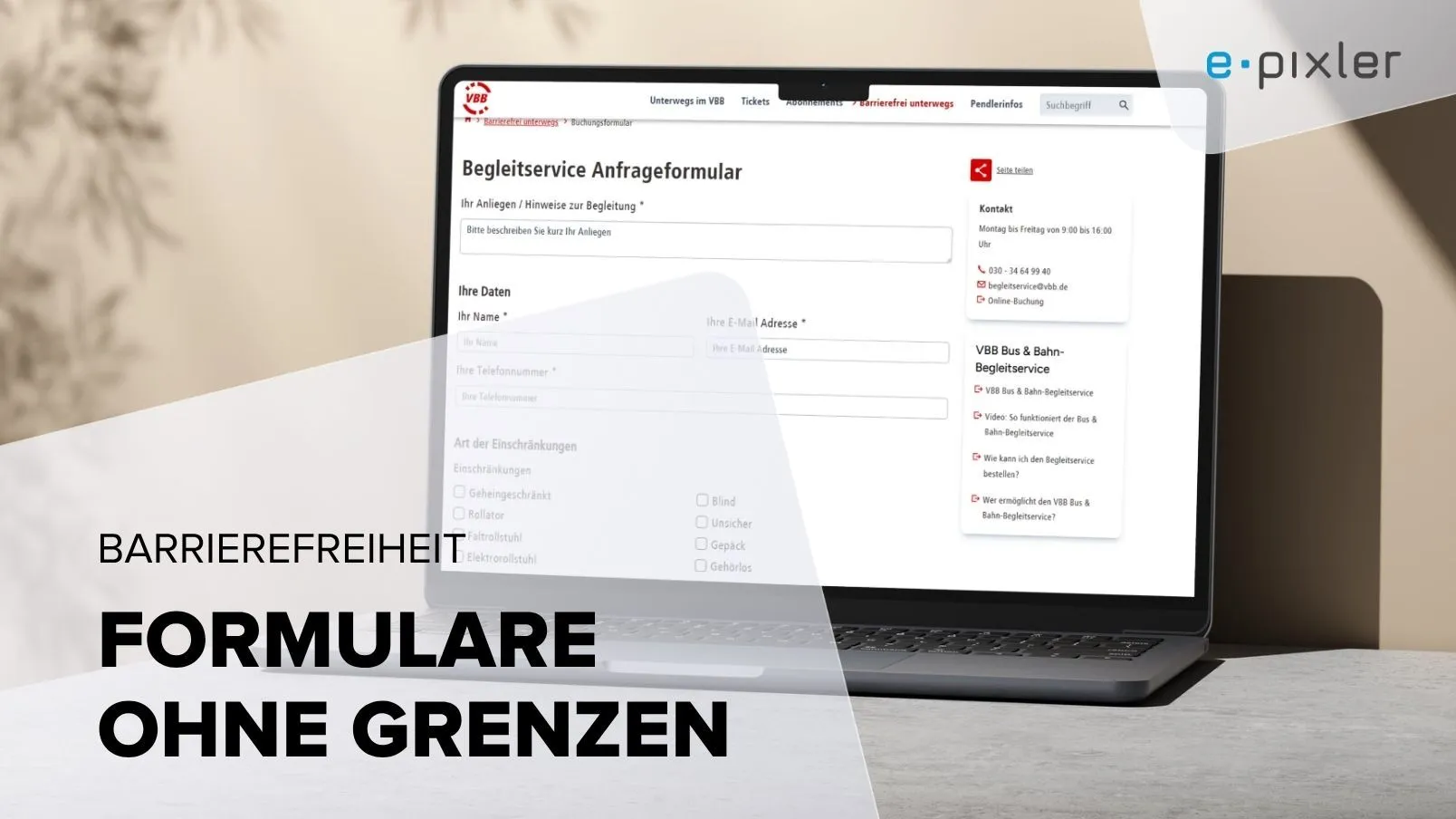
Design forms to be accessible
One of the most important areas in implementing accessible websites is the design of forms, because this is where a high level of interaction with the user is required.
Accessible standards for forms
Especially for forms, it is important to use the standard HTML elements intended for the purpose and to avoid individual solutions wherever possible, because:
- All end devices, including assistive technologies, fully support these standard elements.
- Custom adaptations may not be reflected at all on different end devices (as manufacturers may interpret the display very differently for usability reasons).
- Custom-built or heavily adapted components or functions do not work flawlessly with all end devices, including all possible assistive technologies.
How do I build an accessible form?
When creating forms, the following should be used as far as possibleFieldsetswith the corresponding Legends. A fieldset groups together components or areas that belong together thematically and, especially in large forms, creates a more easily understandable structure.
This can be a general grouping, for example all input fields for “personal data”. But especially for multiple inputs (checkboxes + radio buttons), it helps to think of the individual options as one component.
- All input options must be clearly and unambiguously labeled by their respective Labels.
- All interactive elements must be displayed large enough so that they can be used safely even with motor impairments.
- Input options should be sized appropriately according to their content (a multi-line input must be clearly recognizable as such).
- The Tab order must correspond to the logical flow of the content (the structure in the source code is decisive here). For example, if a form absolutely must be laid out in two columns, with personal information entered in the left column and other topics requested in the right column, then the block with the personal data must of course be completed first before moving on to the next block.
- Required fields must be clearly recognizable as such. In the event of input errors, the incorrect entries must be clearly marked and provided with a clear error message.
Note:Each required field is also always a hurdle – therefore these should be limited to what is truly necessary. This also corresponds to the principles of data protection.
- There must always be an opportunity for error correction before the entries are finally submitted, e.g. a preview step of the entered data with the option to adjust them again.
- The focus must be clearly indicated so that keyboard users can always see where they are in the form.
To improve usability with assistive technologies, additional ARIA attributes can be used in forms, such as:
aria-required="true"– marking required fieldsaria-invalid="true"– marking incorrect entriesaria-live="polite"– For dynamic messages, e.g. error messages or noticesaria-labelledby="ID of the element"– Title assignment via another elementaria-describedby="ID of the element"– Reference to a descriptive element, e.g. a fill-in aid
What does a placeholder attribute do for me?
The Placeholder attribute is directly in the input field and disappears as soon as focus moves to that field. In principle, this can be helpful – however, problems can also arise:
- The placeholder is often displayed by the browser with very low contrast and may therefore be difficult to read.
- Adjusting the contrast of the placeholder can cause confusion, as the field appears to be filled in.
- Since a placeholder does not replace a label, the information is often redundant, which can be hindering – e.g. if a screen reader first reads the label and then the placeholder. (Purely visually hiding the label is therefore only of limited use, as it may still be read aloud.)
- The use of so-called Fly-out labels (the label initially appears where the placeholder is and is pushed out of the field when focused) carries the risk that this animation seems confusing and distracts from the actual input process.
What do I need to consider with placeholders?
A placeholder can provide additional information , which however must not be essential for using the form, as it may not be perceived by all users. Notes and fill-in aids can alternatively be placed elsewhere – with a direct reference via aria-describedby.
These things should be considered in forms:
In addition to accessible design, general best practices for forms also apply, e.g.:
- Avoiding duplicate entries (e.g. asking for the email address twice – here the first entry is often simply copied).
- The simplest and most noticeable form layout for forms is a single-column layout (everything one below the other).
- The result – whether sent successfully or with errors – should be clear and explicit communicated.
- In the case of multi-step forms , it must always be clear at which stage you are. Moving forward and back should be possible without data loss.
Forms with added value
The basic rule is: forms should be as simple and reduced to the bare essentials designed – this creates the greatest benefit for all users.
Aktuelles zu „Accessibility“
Alle Beiträge anzeigen


Sie wollen ein Projekt mit uns realisieren?
Schreiben Sie uns gern oder rufen Sie uns an unter
