

StorageBook
Smart search functions for storage space finders
StorageBook is a platform that gives users access to storage providers near them. With a combination of precise filter options and a user-friendly map search, StorageBook is a valuable tool for both private individuals and businesses.
The challenge: After years in use, the existing website was due for a comprehensive relaunch. The goal was to create a modern and long-term scalable foundation that supports both the increased demands of users and the future development of StorageBook.
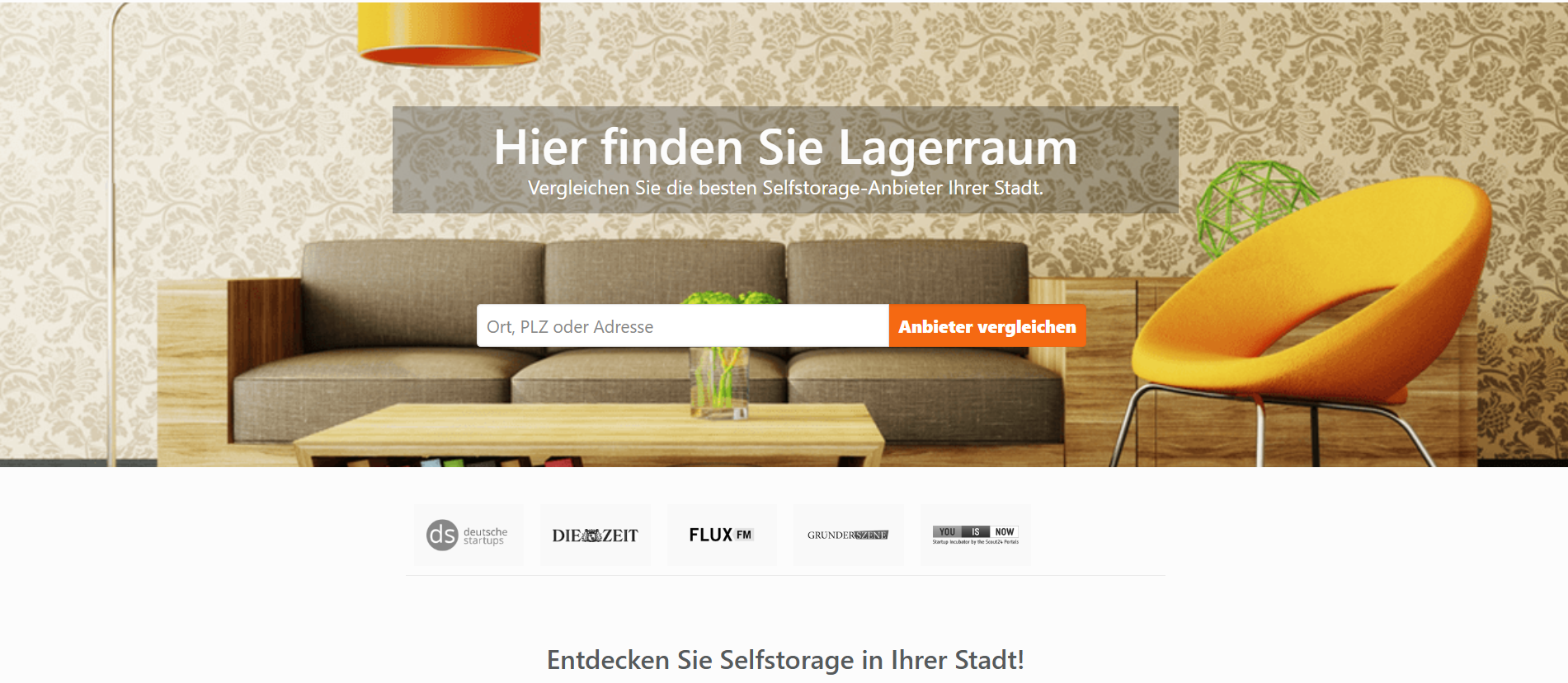
StorageBook before the refresh
The previous StorageBook website was based on the WordPress CMS and served its purpose reliably for many years. However, the requirements for the modern operation of a platform like StorageBook had evolved: The user guidance needed fine-tuning, and some functions were difficult to adapt or expand. Visually, the site lacked a more consistent visual language in order to create a clearer brand identity. With these points in mind, it was time to give the website a fresh look and a modernized technical foundation.
From the Ground Up
For the relaunch, we set new standards and moved StorageBook to a completely new technical foundation:
CMS upgrade: To create a flexible and future-proof platform, we switched to Payload CMS, which offers maximum performance and adaptability thanks to its modern architecture.
Modern frontend: Development with Nuxt.js and TypeScript for a lightning-fast and user-friendly interface.
Customer dashboard: Integration of a secure and high-performance MariaDB database via Prisma.js, which maps the customer's individual requirements.
Google Maps integration: Implementation of an interactive map with pins and radius search to significantly improve targeted searches for storage spaces.
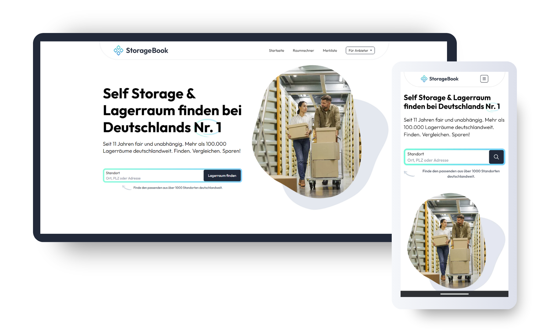
storagebook.de - after the Relaunch
A modern design that convinces
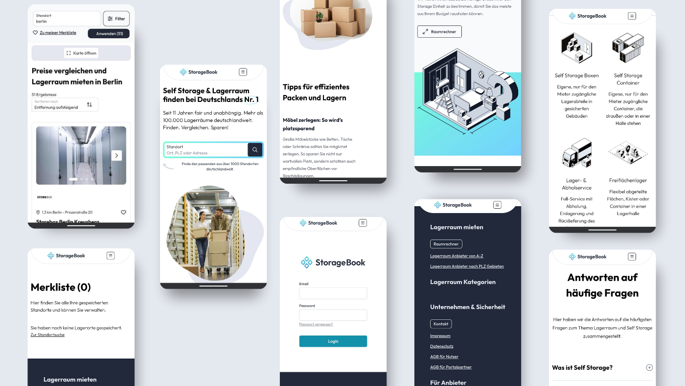
In close collaboration with the customer, we first gathered all requirements and ideas so that the new UX/UI concept could be implemented precisely. This resulted in a design that feels both minimal and high-quality. The monochrome color palette creates a clean, uncluttered look, complemented by a new, professional illustration style.
Rejuvenated visual language: Self-drawn graphics were replaced with a consistent look that is easy to expand and runs uniformly across the entire website.
Reworked logo: For the relaunch, the existing logo was carefully modernized to fit harmoniously into the new design, with a new typeface, improved kerning, and an optimized gradient.
Improved user guidance
Filtering and finding: The search results pages were structured more clearly and supplemented with additional filter options.
Map search: The interactive elements of the new map display create intuitive operation.
Detail pages: Content on the offer pages was presented more compactly and with greater visual breathing room; blocks, lists, and icons make navigation even easier and more appealing for the user.
With the relaunch, we made the platform future-proof and created an environment that impresses both technically and visually.